The landscape of neutral colors is experiencing a significant evolution. Where once cool grays and simple beiges were the go-to choices, today’s interiors are embracing a broader palette filled with inviting, layered hues that bring both elegance and comfort. This shift is transforming American homes, making them feel more timeless and uniquely personal. After fifteen years in the design industry, I can say I’ve never witnessed a color movement that so profoundly influences the way people experience their living spaces.
Shifting Tones: The Modern Neutral Revolution
For years, gray reigned supreme in interior design, but now a new wave of warmer tones is making its mark—infusing rooms with softness and dimension. The “modern neutrals” now include:
- Cream, beige, taupe, and greige (a blend of gray and beige)
- Oatmeal, biscuit, and sand-inspired hues
- Warm shades with delicate undertones
- Unexpected neutrals such as sage green and blush
These contemporary neutrals are quickly becoming a staple in home decor, offering a natural, welcoming alternative that feels both sophisticated and cozy. Their true strength lies in their adaptability – they can be understated yet inviting, and minimal yet full of warmth.
The Designer’s Perspective: Why Warm Neutrals Matter
When clients question the popularity of these new shades, my response is straightforward: these colors create a sense of belonging. Beige, for example, radiates more warmth than gray and pairs beautifully with tones that have yellow undertones, like browns and taupes. This combination fosters a welcoming ambiance that cooler grays sometimes lack.
Key advantages of embracing warm neutrals:
- They infuse any space with a gentle, luminous warmth
- They foster a snug and welcoming atmosphere, regardless of the room’s orientation
- They harmonize well with organic materials
- They deliver greater richness and personality compared to cooler hues
This strategy is also embraced by many interior designers, who select beige or gray based on the overall warmth or coolness of the room’s color scheme. For example, a gray textured sofa might be chosen to complement cooler shades like blues and greens, while beige is often preferred to create a lighter, more inviting atmosphere.
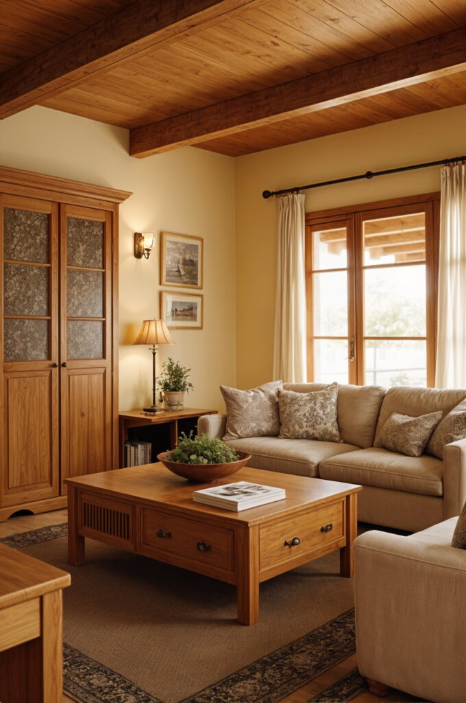
Applying Warm Neutrals Throughout the Home
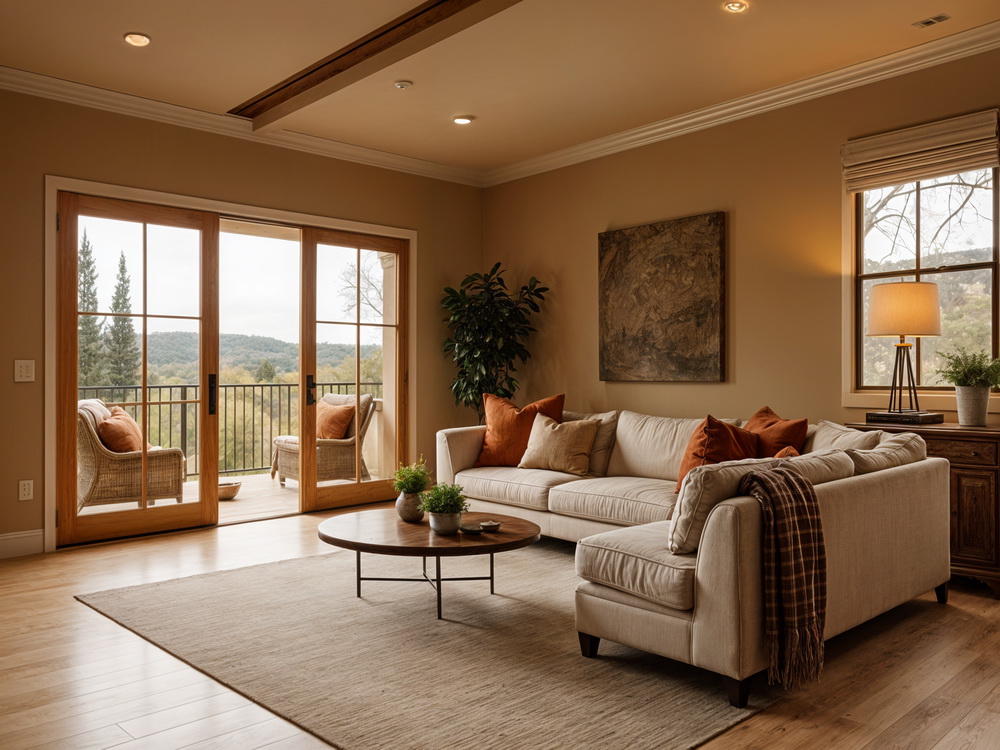
Living Areas
The living room serves as a perfect backdrop for exploring the possibilities of warm neutrals. Layering various tones within the same neutral spectrum is essential—this method brings depth and subtle complexity to the space without resorting to vivid colors.
In rooms facing north, where daylight tends to be cooler, using warm neutral shades helps counteract the chilliness of the light. Conversely, south-facing spaces benefit from neutrals with cooler undertones such as oatmeal or hazel, which help maintain a balanced look and prevent the room from appearing overly yellow.
A fundamental aspect of this approach is the thoughtful layering of textures. Mixing materials like chunky knits with sleek leather introduces both warmth and dimension, ensuring the room remains visually engaging even when the color palette is restrained.
Bedrooms
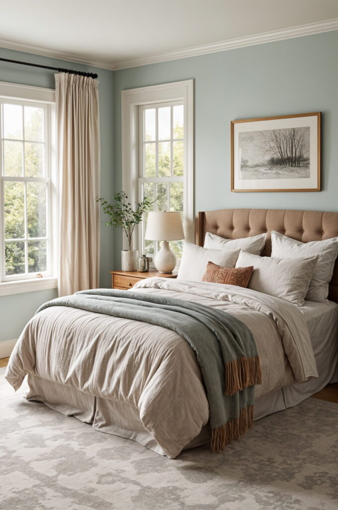
When designing bedrooms with contemporary neutrals, my aim is to cultivate a tranquil, retreat-like setting:
- Walls painted in gentle taupe or beige with subtle blush undertones
- Bedding layered in multiple textures within the same neutral palette
- Incorporation of natural elements such as linen, wool, and raw wood
- Soft transitions between tones to preserve a peaceful ambiance
A soothing mix of warm neutrals, matte paint finishes, and tactile fabrics is unmatched in its ability to create a restful environment. In a recent project, transforming a primary bedroom from stark white walls to a soft, blush-tinged neutral completely changed not only the appearance but also the overall mood of the space.
Kitchens and Bathrooms
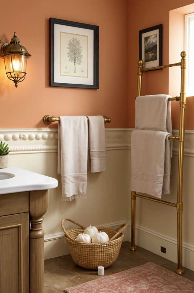
Kitchens and bathrooms are ideal for showcasing modern neutrals. Warm taupes and greiges for cabinetry offer a sophisticated alternative to white or gray. Consider:
- Countertops in stones or composites with warm undertones
- Backsplashes featuring natural textures
- Brass or bronze fixtures instead of chrome
- Flooring in organic materials with a warm base
Crafting a Cohesive Neutral Palette
Factoring in Natural Light
| Room Direction | Best Neutral Shades | Reasoning |
|---|---|---|
| North | Warm beiges with pink hints | Offsets cool daylight |
| South | Cooler neutrals (oatmeal, hazel) | Balances warm sunlight |
| East | Warm greiges | Enhances morning light |
| West | Soft sand hues | Accentuates evening glow |
For north-facing spaces, it’s best to opt for warmer beiges with pink undertones, as these shades complement other colors effectively. In contrast, south-facing rooms that receive abundant warm light throughout the day can accommodate any beige shade, which will appear bright and open.
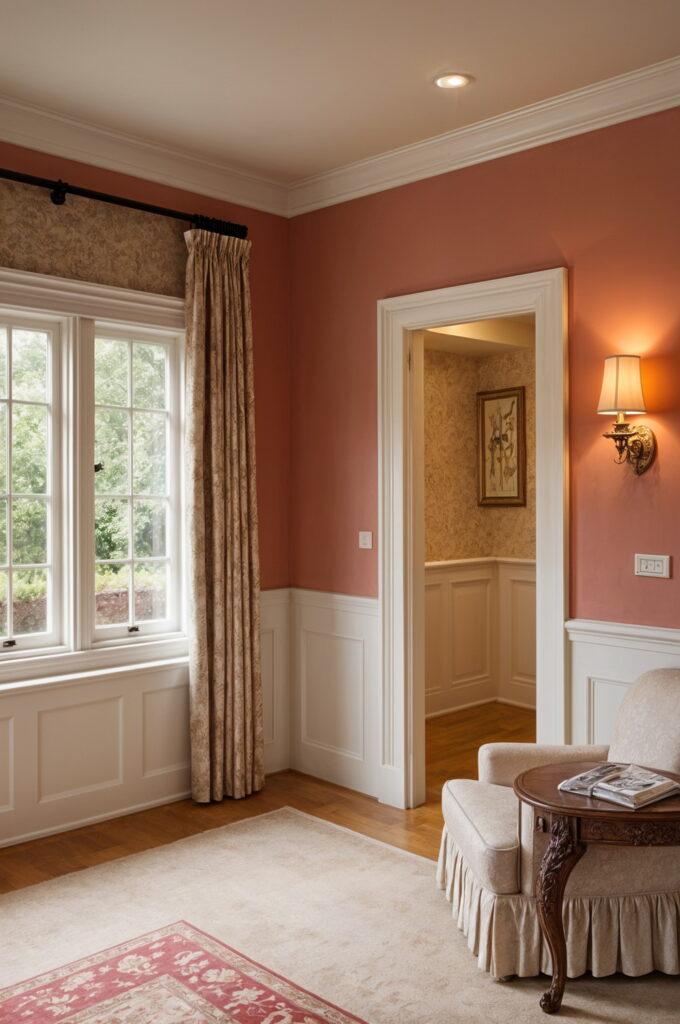
Coordinating with Architecture
When picking the right neutral, always consider the home’s architectural details:
- Natural wood trim pairs best with beige over gray
- True white trim can make gray feel crisp and modern
- Historic homes shine with neutrals that have subtle undertones to complement period features
- Contemporary designs can handle both warm and cool neutrals, depending on the materials used
Extending Neutrals Outdoors
The influence of new neutrals is reaching far beyond interior spaces, transforming the way outdoor areas are conceived and designed. Having worked on both interiors and landscapes, I’ve observed how these color palettes foster a sense of unity between indoor and outdoor environments.
Today’s American landscape design often features:
- Prairie-inspired plant groupings, with ornamental grasses playing a central role
- Dramatic visual impact through expansive drifts of plants in understated hues
- Neutral hardscape surfaces accented by thoughtfully placed bursts of color
- An informal, organic style that stands in contrast to the structured look of classic European gardens
A hallmark of this approach is the generous use of ornamental grasses, which create flowing patterns of color within open, naturalistic spaces. These grasses add gentle movement to the landscape and serve as an elegant backdrop for vibrant clusters of flowering plants, creating a garden that feels both dynamic and serene.
Recommended Plants for Neutral Gardens
For those aiming to achieve this look, we suggest incorporating:
- Ornamental grasses in a range of heights and textures for visual interest
- Black-eyed Susans (Rudbeckias) to introduce bold, geometric shapes
- Sedums and other resilient, mound-forming plants
- Native species that thrive in your local climate
This year’s garden trends emphasize earthy neutrals and sage greens, blending contemporary sophistication with natural materials. These color schemes not only enhance the beauty of outdoor spaces but also promote sustainability and require less maintenance.
Real-Life Transformations
Case Study: From Gray Enthusiast to Warm Neutral Advocate
Emily once dismissed beige as dull, fully embracing the gray trend throughout her contemporary townhouse. Her home featured charcoal-painted walls, gray furnishings, and matching kitchen cabinetry, creating a space that appeared stylish but gradually felt cold and unwelcoming.
When we suggested shifting to warmer neutrals, she was hesitant but agreed to try it in her home office. We chose a warm taupe with a hint of pink for the walls, introduced natural wood shelving, and layered in a variety of neutral textures.
The change was striking—impacting not only the look but also the atmosphere of the room. Emily later shared, “I didn’t realize how much tension I felt in my old office until I experienced the serenity of this new space.” Inspired by the difference, she has since decided to update the rest of her home with this cozier palette.
Case Study: Embracing Modern Neutrals in the Garden
For homeowners moving away from a classic garden style toward a more eco-friendly approach, we recently designed a landscape featuring sweeping drifts of ornamental grasses, native shrubs, and sculptural plants in gentle shades of green, taupe, and sandy beige.
This garden now thrives with minimal irrigation, mirrors the character of the local environment, and delivers understated beauty year-round. Above all, it captures a uniquely American sensibility—purposeful and rooted in its surroundings, striking a balance between structure and natural freedom
How to Integrate Modern Neutrals in Your Home
Easy Ways to Begin
If you’re hesitant to make a big change, try these small steps:
- Add warm neutral accessories like pillows or vases
- Build a color scheme around a favorite artwork or textile
- Use your current neutral walls as a backdrop for warmer accents
- Start with a small space, such as a powder room, before moving on to larger areas
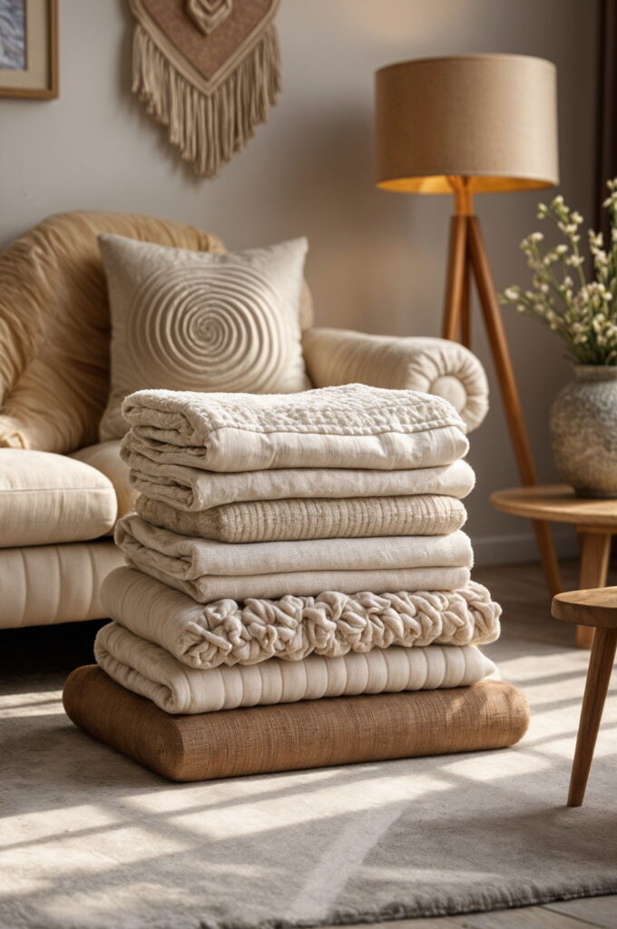
Layering for Interest
In my experience, creating harmonious neutral interiors relies on thoughtful layering:
- Use at least three distinct textures within the same color palette
- Mix patterns of different scales when pairing neutral tones
- Blend matte surfaces with those that have a subtle sheen
- Introduce multiple shades from the same color family to build visual depth
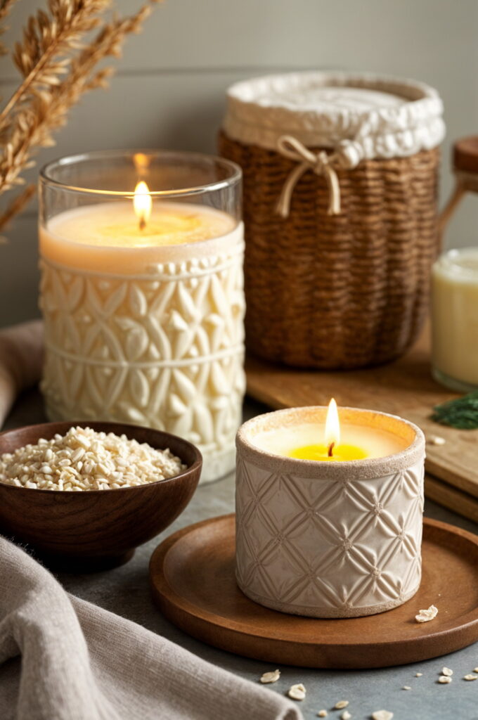
Essential Elements to Include
- Natural fibers: linen, jute, wool, cotton
- Organic materials: wood, stone, rattan, cane
- Tactile finishes: bouclé, sherpa, velvet, leather
- Architectural features: plaster, textured tile, woven accents
Looking Ahead: The Enduring Appeal of Warm Neutrals
Although design fads tend to come and go, the current move toward warmer, more complex neutrals signals a broader cultural desire for homes that feel genuine, inviting, and closely tied to the natural world. This trend goes beyond mere color selection—it speaks to how our connection with our living spaces is evolving.
As many designers observe, the era of cool-toned grays and overly yellow beiges is fading. Today’s beige brings both warmth and timelessness, making it ideal for creating cozy, earthy interiors. It pairs effortlessly with warm woods and rich jewel tones, making it a versatile choice for family spaces, bedrooms, or kitchens—anywhere a comfortable, welcoming atmosphere is desired.
Sources:
The Power of Neutral in Health Club Color Schemes
https://www.healthandfitness.org/improve-your-club/the-power-of-neutral-in-health-club-color-schemes/
Interior Designer’s Favorite Neutral Paint Colors
https://interiorimpressions.org/2019/08/16/favorite-neutral-paint-colors-round-up/
Explore the Color Psychology in Interior Design
https://www.poddarinstitute.org/articles/explore-the-color-psychology-in-interior-design
Designing a Mood-Boosting Garden
https://www.designerviews.org/Color-Psychology-in-Landscaping:-Designing-a-Mood-Boosting-Garden/I374.htm
Basic Principles of Landscape Design
https://www.bgohio.org/DocumentCenter/View/880/Principles-of-Landscape-Design-PDF